Experian
✅ Led content for a major U.S. credit bureau ✅ Owned 15 areas of the product ✅ Content you've probably (definitely) interacted with
✅ Led content for a major U.S. credit bureau ✅ Owned 15 areas of the product ✅ Content you've probably (definitely) interacted with

PROJECT LEAD
UX WRITER
UX WRITING
CREATIVE DIRECTION
Experian Boost users were hitting a dead end when the product couldn’t find eligible bills. Research across 200+ support tickets and 12 user interviews revealed the bigger problem: users didn’t understand why it happened or what to do next.
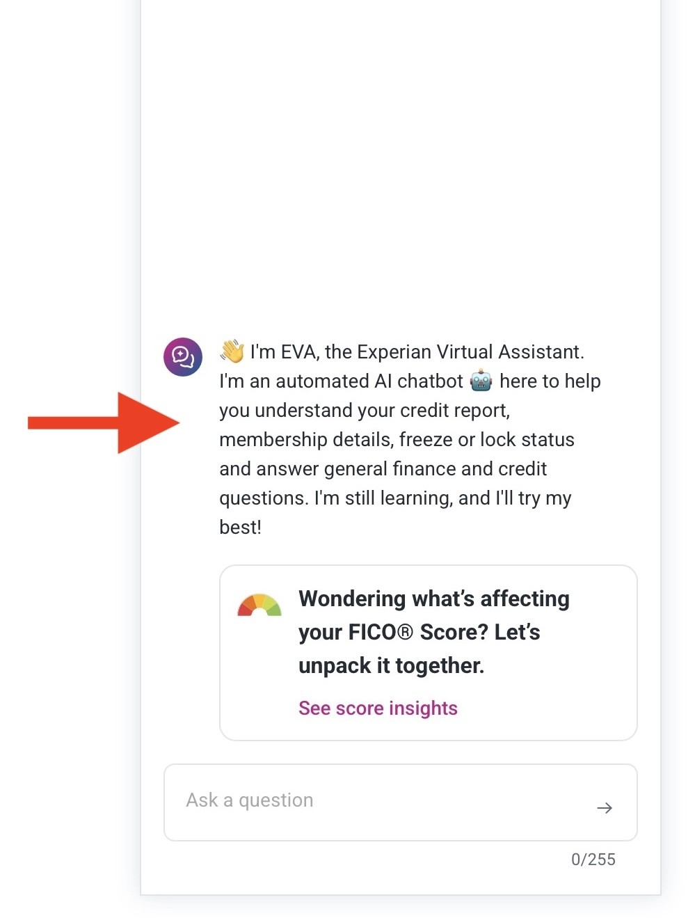
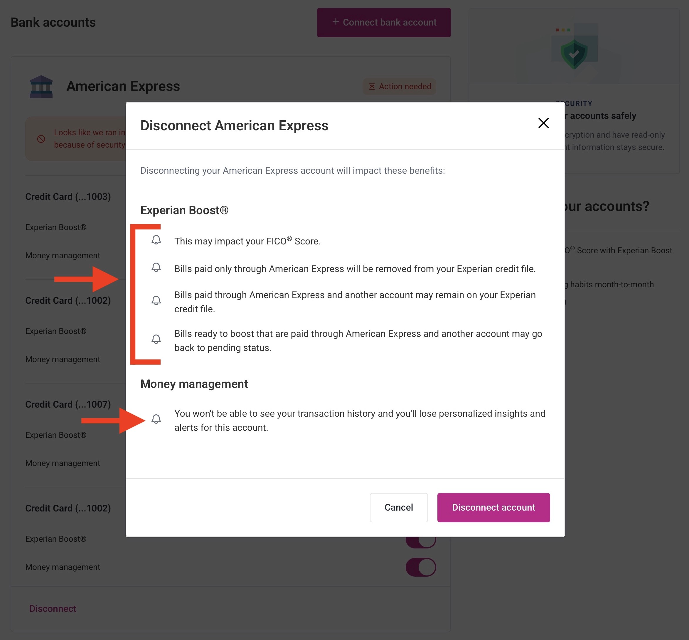
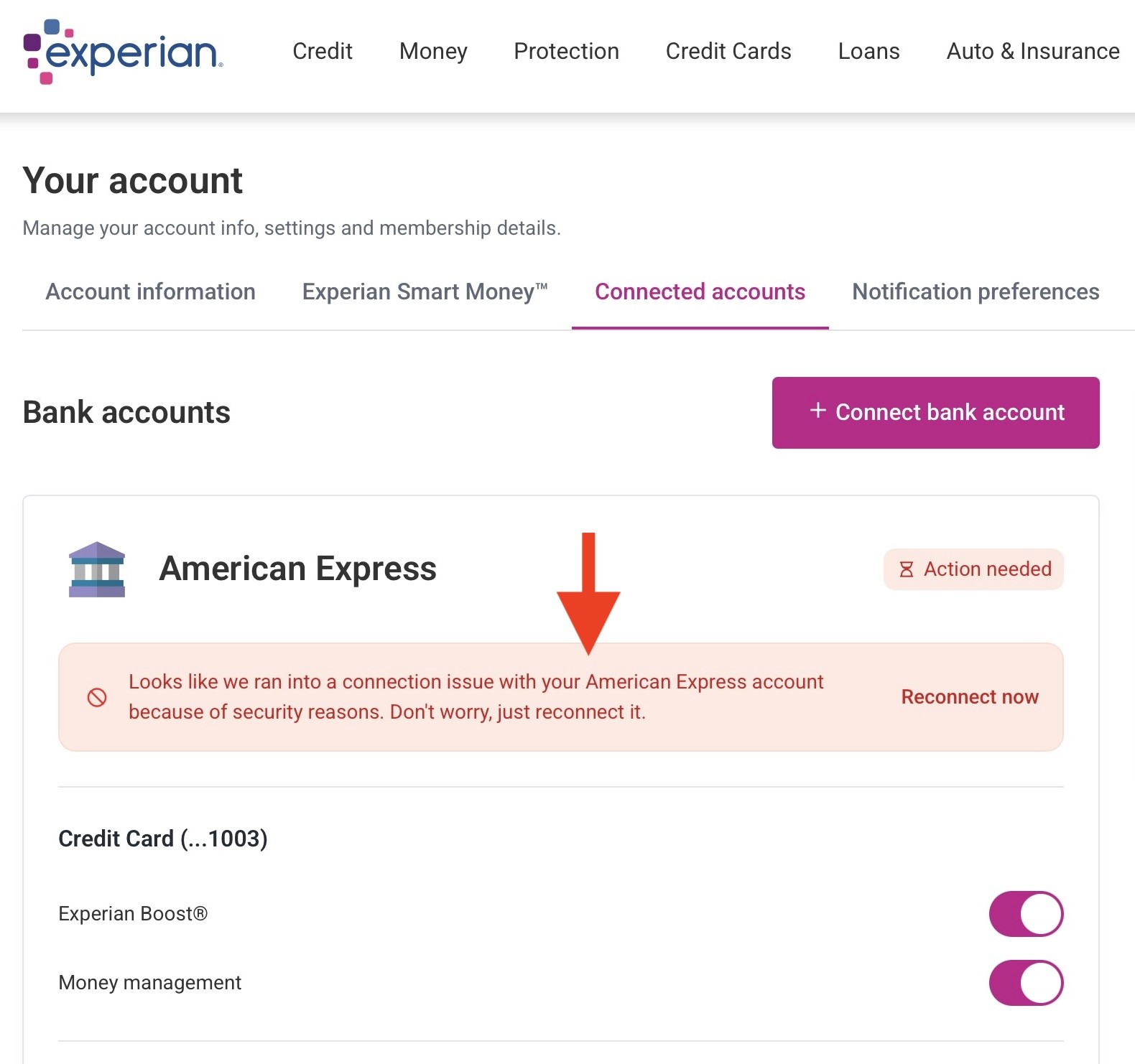
I redesigned the experience around clear status messaging, user-led FAQs and an actionable path forward, then tested and refined the content and information architecture before launch.
The result: 34% fewer related support tickets and 28% more account reconnections within 60 days

✅ Led content for a major U.S. credit bureau ✅ Owned 15 areas of the product ✅ Content you've probably (definitely) interacted with
PROJECT LEAD
UX WRITER
UX WRITING
CREATIVE DIRECTION
Experian Boost users were hitting a dead end when the product couldn’t find eligible bills. Research across 200+ support tickets and 12 user interviews revealed the bigger problem: users didn’t understand why it happened or what to do next.
I redesigned the experience around clear status messaging, user-led FAQs and an actionable path forward, then tested and refined the content and information architecture before launch.
The result: 34% fewer related support tickets and 28% more account reconnections within 60 days
✅ Led content for a major U.S. credit bureau ✅ Owned 15 areas of the product ✅ Content you've probably (definitely) interacted with
PROJECT LEAD
UX WRITER
UX WRITING
CREATIVE DIRECTION
Experian Boost users were hitting a dead end when the product couldn’t find eligible bills. Research across 200+ support tickets and 12 user interviews revealed the bigger problem: users didn’t understand why it happened or what to do next.
I redesigned the experience around clear status messaging, user-led FAQs and an actionable path forward, then tested and refined the content and information architecture before launch.
The result: 34% fewer related support tickets and 28% more account reconnections within 60 days